Decoding Urban Mobility

PROJECT:
FOCUS:
ROLE:
YEAR:
THE BIGGER PICTURE
Cities are changing. But the way we understand mobility is still fragmented.
We are used to seeing traffic, crowded roads and stories about rising private vehicle ownership. The conversation around urban mobility often begins with congestion. But congestion is only one part of the story. But that's just one part of the story and cities need to understand how people move across different modes, what the infrastructure enables, and how accessibility and sustainability are connected.


More roads.
More flyovers..
More cars..
More networks..
Government
Open Street Map
Google APIs
Primary Research
GTFS
Urban planners and researchers
City and transport reporters
Citizen groups
Urban policymakers and transport agencies
USERS
THE SHIFT
Beyond congestion.
The data already existed. The challenge was making sense of it.
Shift Transport is a collaborative initiative focused on better decision-making through visualisations based on data-driven and evidence-based approaches. This Transport Analytics Hub (TAH) transforms complex transport data into a live, interactive decision-support environment, to enable cities to plan, advocate, and invest in sustainable mobility solutions with confidence.
I structured the experience around the questions people needs answers to and not around the datasets themselves.
INFORMATION ARCHITECTURE
But organising the system is only half the problem. The experience also needed to guide people through it.
Modes
Networks
Comparison
Scenarios
Indicators
City
Establish Context
Establish the system
Go deeper
Choose a city
Explore transport metrics and networks
Compare indicators and investigate patterns
01
02
03
Metro
Bus
Auto
Walk
Two-wheeler
Roads
Routes
Connectivity
Coverage
Vehicle growth
Performance
Modal Share
Mobility
Emissions
Safety
From exploration to decision-making.
USER FLOW
I structured the experience around the questions people needs answers to and not around the datasets themselves.
From complexity to a navigable system.
Choose your city
The experience starts with a city, giving users a clear geographical context before exploring mobility data.
Explore
Understand
Compare
Ask What if?
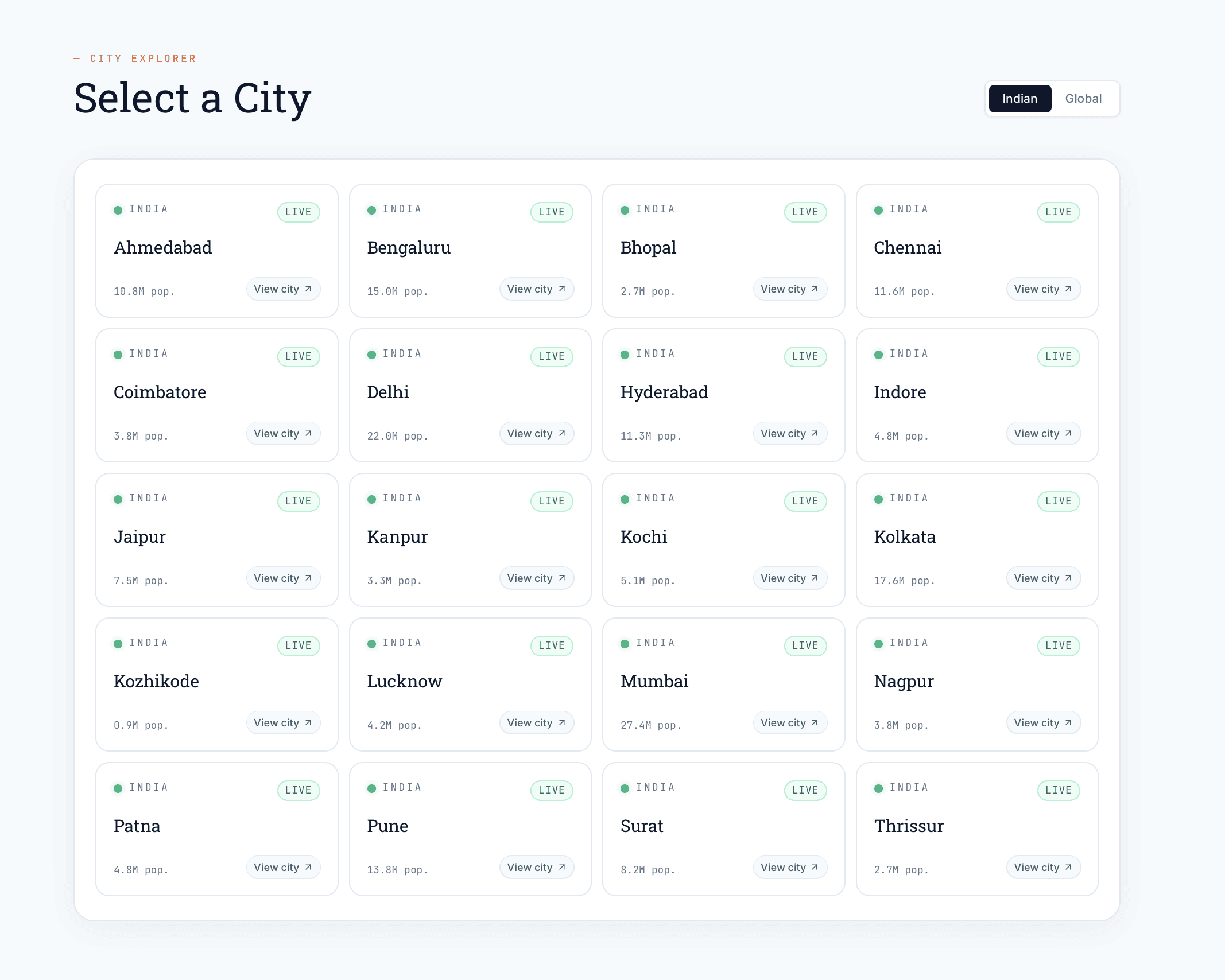
THE DASHBOARD
TAH is not just a dashboard for viewing mobility indicators; it provides tools for data query, exploration, scenario analysis and decision support and brings together datasets across mobility demand, transport supply and system performance, creating a more holistic understanding of how cities move.

From numbers to relationships.
PROGRESSIVE DISCLOSURE
Urban mobility is made up of interconnected datasets, but users don't need to understand that complexity all at once. I used progressive disclosure to establish a clear hierarchy starting with high-level signals and revealing deeper layers as users move from exploration to analysis.
Key indicators establish an immediate understanding of the city's mobility picture
Users can move into specific mobility dimensions and their underlying measures.


Numbers become more meaningful when viewed in context. Users can compare cities, modes and indicators to identify patterns, differences and areas that need attention.
03
01
02
Complexity doesn't have to mean clutter.


Delhi


How would emissions change with 10% increase in use of public transport?
FROM ANALYTICS TO ACTION
I used progressive disclosure to establish a clear hierarchy starting with high-level signals and revealing deeper layers as users move from data exploration to analysis and finally solutions.
The dashboard is not the destination.
Transport data spans cities, modes, indicators, networks and multiple sources. The challenge was to make these relationships understandable without hiding the richness of the data. The design problem became less about how much information to show and more about when and how to reveal it.
Working on TAH showed me that designing a data-heavy product starts before the interface. Information architecture, hierarchy and progressive disclosure determine whether users can actually make sense of what they are seeing. The goal wasn't to simplify the data itself but was to create a structure that made the complexity navigable.
It would be making the exploration more interactive and allowing users to investigate different scenarios to understand how changes in transport systems could affect mobility outcomes. Making the assumptions, data sources and relationships behind those scenarios visible would make the experience even more useful for decision-making.
THE BIGGER SYSTEM
Advanced mobility analysis is often limited to technical experts or organizations with access to expensive tools. TAH aims to make transport analytics accessible to governments, researchers, civil society, media and communities.
Turning analysis into action

33% increase in feeder bus services, with 2× feeder capacity by BEST and Cityflo.
60+ corporates and public institutions promoted public transport among employees.
MUMBAI